{Brand Identity, Logo, Business Card, Website, Social Media}
Self Project
After obtaining the 200 Hour Yoga Teaching certificate and the 70 Hour Yin Teaching certificate from YYoga, a website was created to help promote Seiko’s yoga teachings which were most often a combination of Flow (strength, endurance, heat) and Yin (flexibility, patience, meditative).
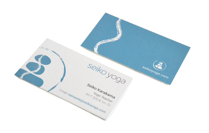
![]() The logo is composed of three stones with a wavy line that goes through all of them. The concept was derived from a personal idea of what yoga is about. The main focus is on balance, so the rock-balancing representation was chosen. Three is a special number representing the mind, body, and spirit, so three rocks were incorporated. Stones represents strength, being grounded and durability. However, being static isn’t necessarily always a good thing, so the element of water or movement was added, represented by the ‘wave’ or water in the middle. It symbolizes fluidity, flexibility and change. It is almost like a yin-yang symbol, representing both worlds of yoga. The circle was added later to show infinity, eternity, unity and wholesomeness.
The logo is composed of three stones with a wavy line that goes through all of them. The concept was derived from a personal idea of what yoga is about. The main focus is on balance, so the rock-balancing representation was chosen. Three is a special number representing the mind, body, and spirit, so three rocks were incorporated. Stones represents strength, being grounded and durability. However, being static isn’t necessarily always a good thing, so the element of water or movement was added, represented by the ‘wave’ or water in the middle. It symbolizes fluidity, flexibility and change. It is almost like a yin-yang symbol, representing both worlds of yoga. The circle was added later to show infinity, eternity, unity and wholesomeness.
The colour blue/teal was chosen to represent calmness, open-mindedness and rejuvenation.
The website seikoyoga.com was created for a way for people to learn and sign up to yoga classes taught by Seiko. It was created and modified using Wix. Instagram account: @seikoyoga